
Projet Name
Clinspire
Duration
4 months
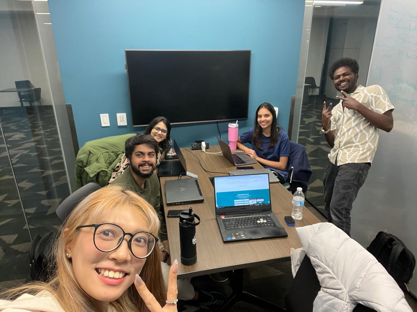
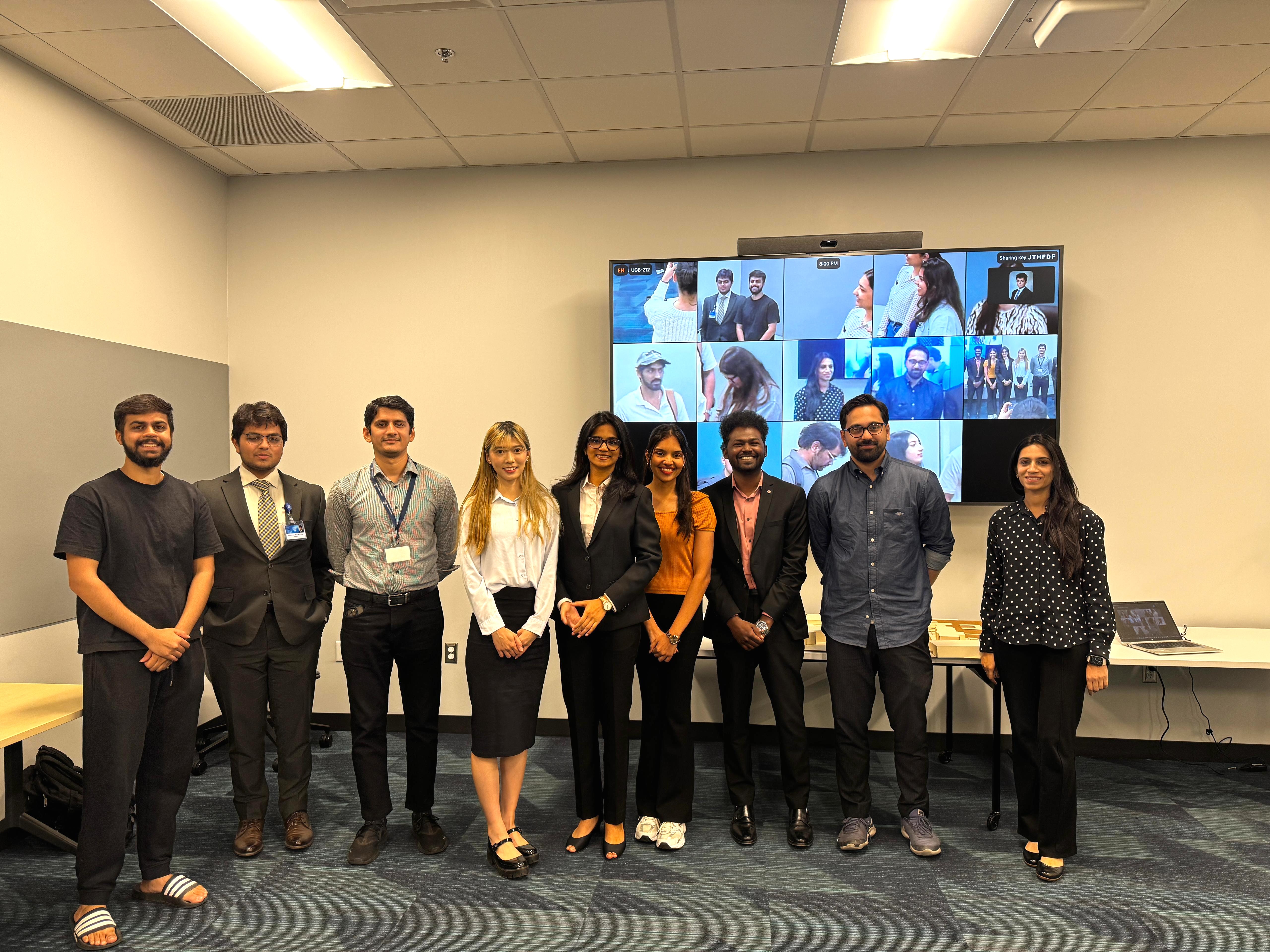
Team


My Role
Research & usability testing
Wireframe & prototype
Projet Name
Clinspire
Duration
4 months
Team
My Role
Research & usability testing
Wireframe & prototype

How might we help patients navigate complex trial eligibility with more clarity, support, and trust — while easing the burden on clinicians?
85% of cancer clinical trials fail to meet enrollment targets — not due to a lack of treatment options, but because patients don’t make it to the starting line.Confusing eligibility criteria, fragmented data systems, and jargon-heavy platforms shut out the very people trials are meant to serve. At the same time, clinicians spend hours manually reviewing patient records — a slow, error-prone process that delays treatment and limits access to care.

Help more eligible patients find and join trials by making the process clear, guided, and personalized.

Deliver a supportive, human-centered experience that keeps both patients and clinicians involved.

Use transparent design, clear language, & explainable AI to foster confidence in both the platform & recommendation

Simplify eligibility checks to reduce the burden on clinicians and enable faster patient-trial matching.
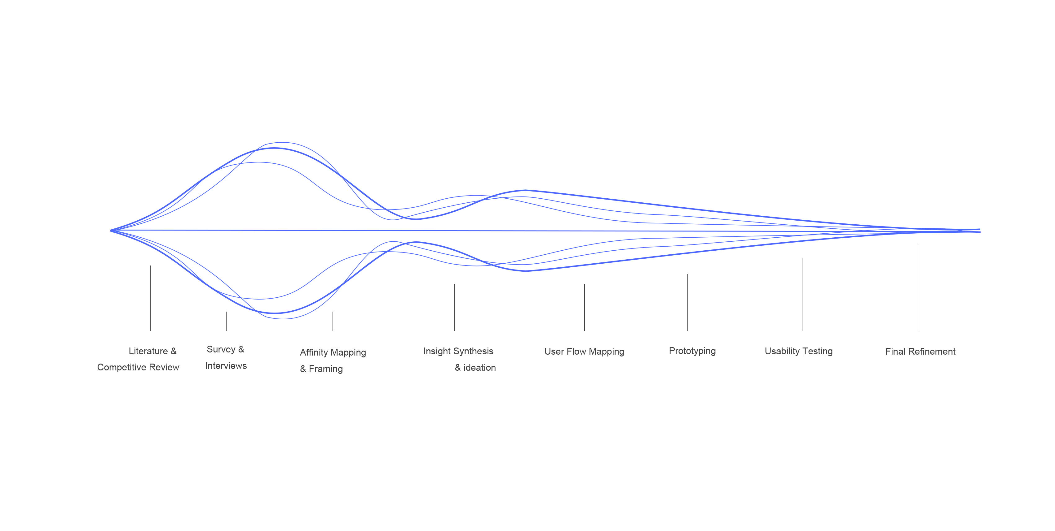

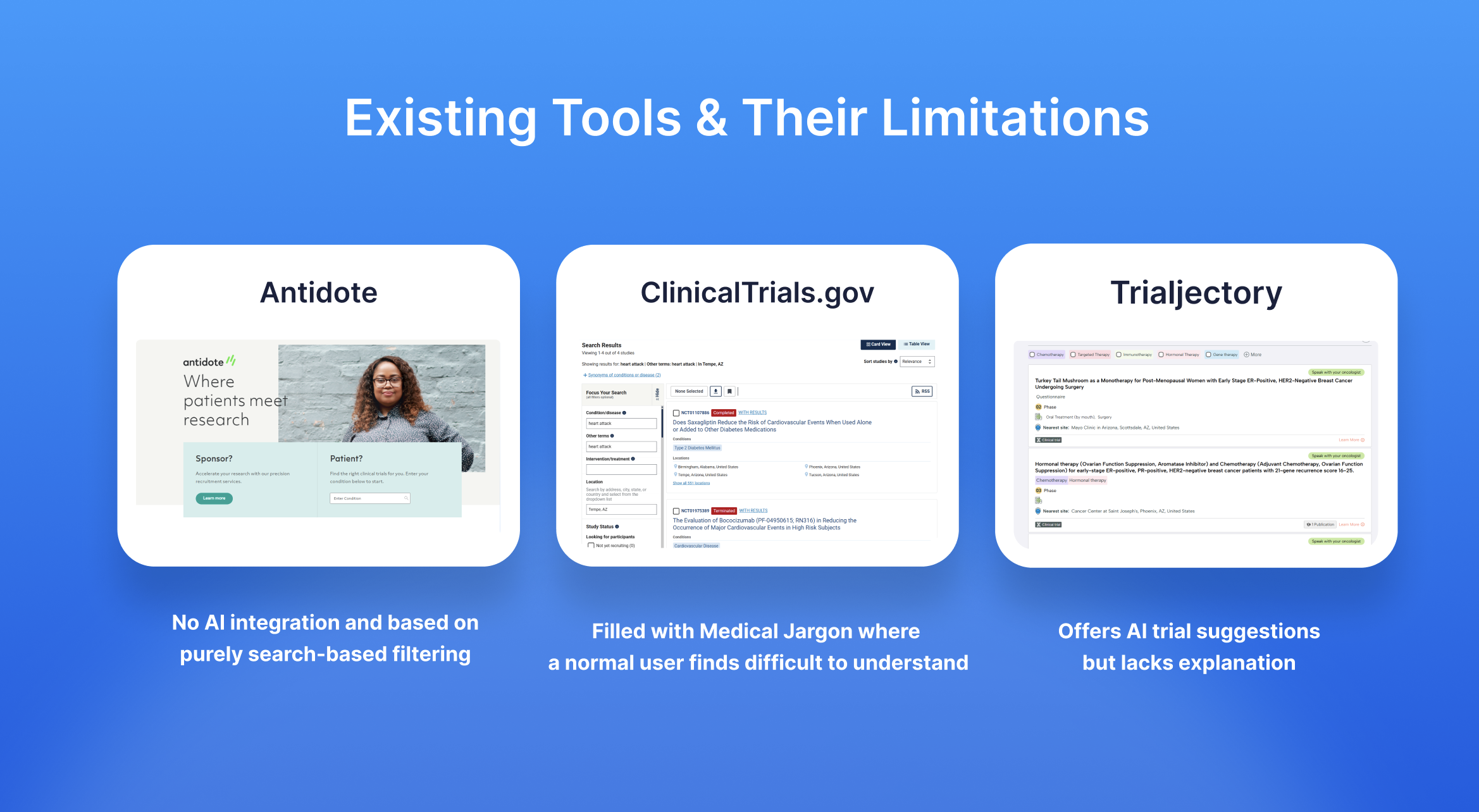
We began by reviewing academic literature and analyzed competitive platforms like ClinicalTrials.gov, TrialJectory, and Antidote to understand why cancer trials struggle with recruitment.
While these platforms aim to match patients with trials, they all fall short in some key areas.
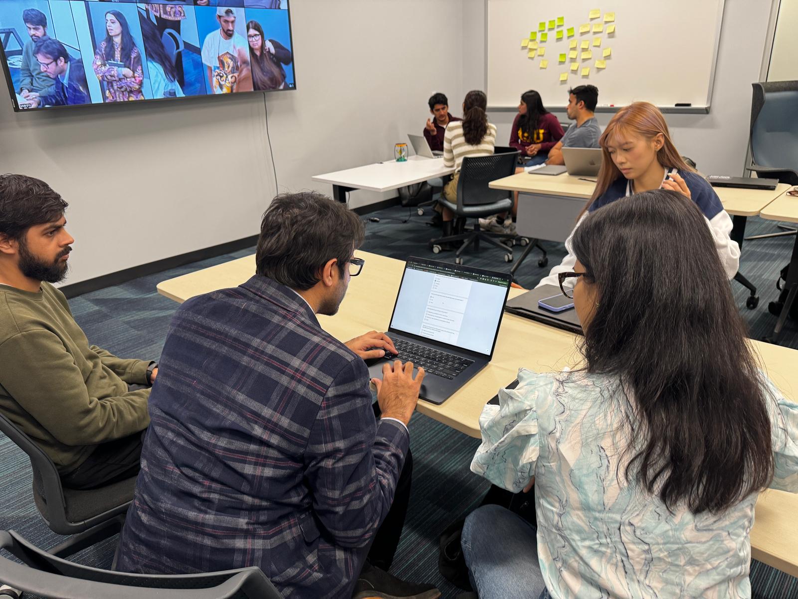
We interviewed 4 oncologists and 6 patients to understand clinical workflow challenges, patient confusion, and expectations around support and trust.
We organized research findings into themes to reframe the problem from the user’s perspective and identify key pain points to address.
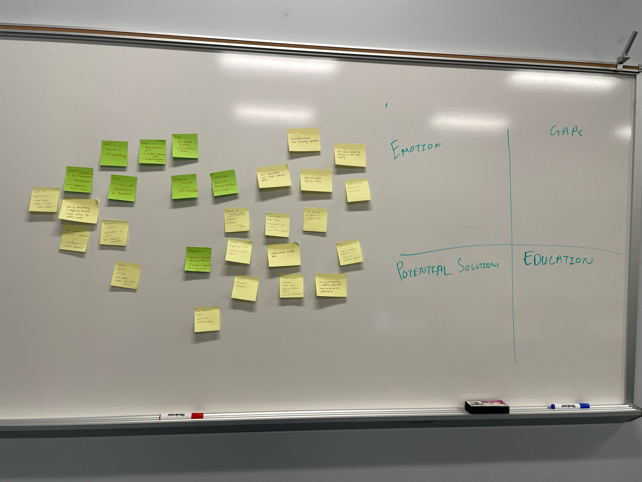
From the research, we defined 4 key problem statements and mapped them to actionable design opportunities.
.svg)
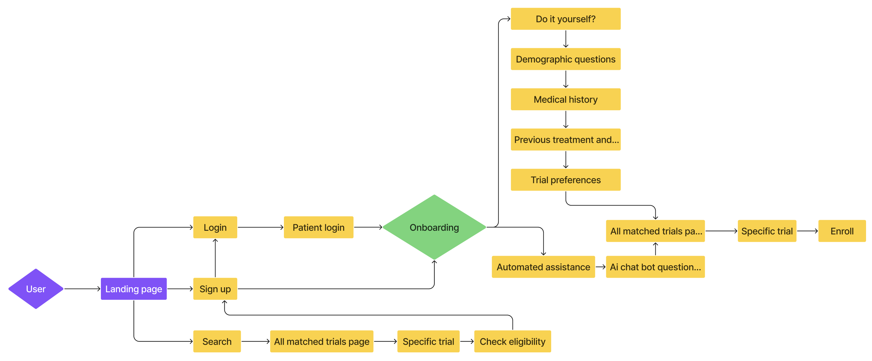
We mapped the patient journey to visualize interactions, ensuring each step met users’ emotional and informational needs.


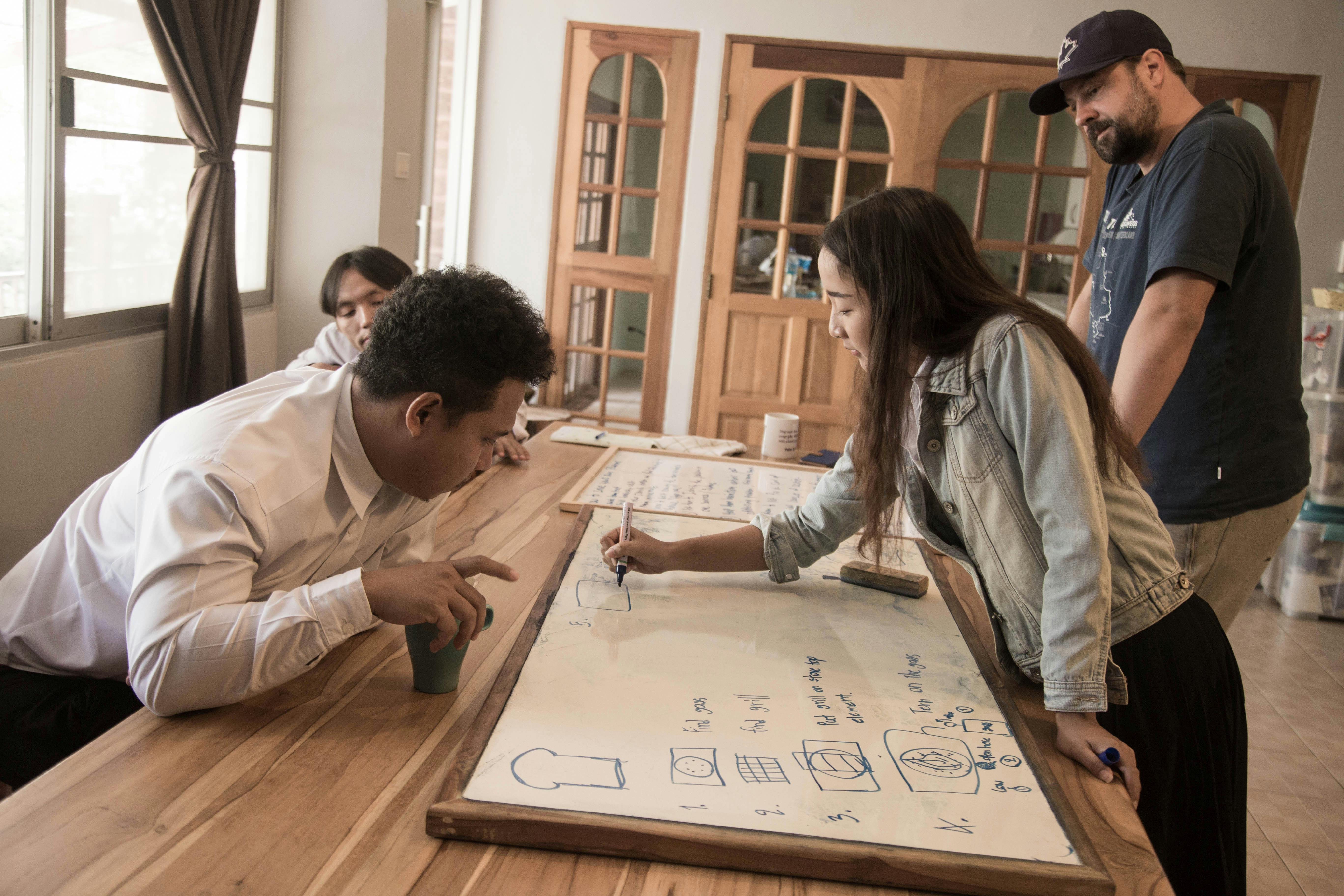
With support from Mayo Clinic clinicians, we tested prototypes with patients, caregivers, and providers through interviews and co-creation sessions. Their feedback directly informed key iterations, which are detailed in the following section.
As we designed the trial detail page, we ran into a recurring challenge:
how do we display complex trial information without overwhelming users?
Patients — especially older users — needed a layout that was simple, clear, and easy to navigate. We explored three iterations, each addressing content hierarchy, layout space, and ease of access.
Iteration1
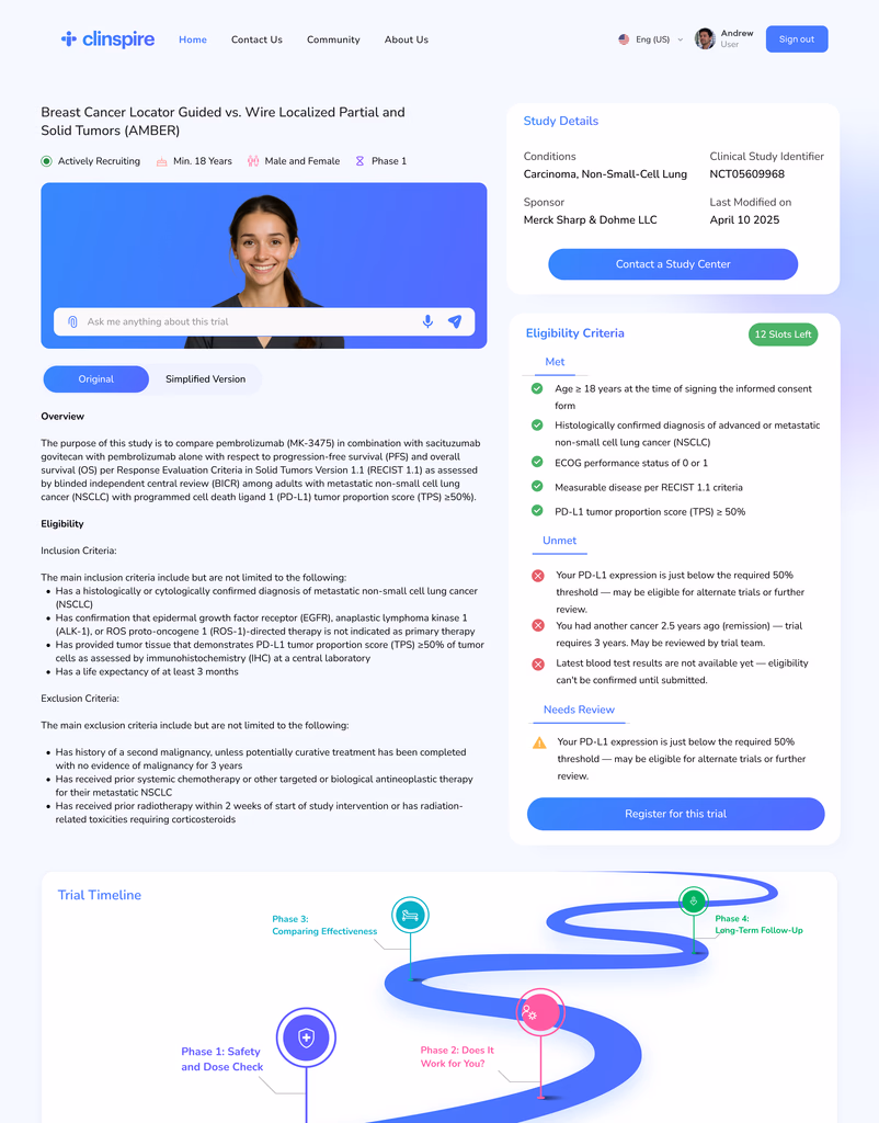
❌ Eligibility criteria took over the screen
❌ Study details appeared first, despite being low-priority
❌ No in-page navigation
Iteration2
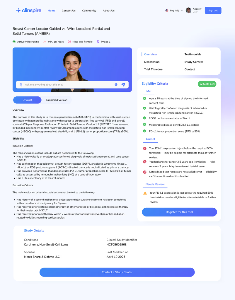
✅️ Added side navbar for faster access
❌ Eligibility and study info still dominated the layout
❌ Lacked spatial balance and felt cluttered
Iteration3
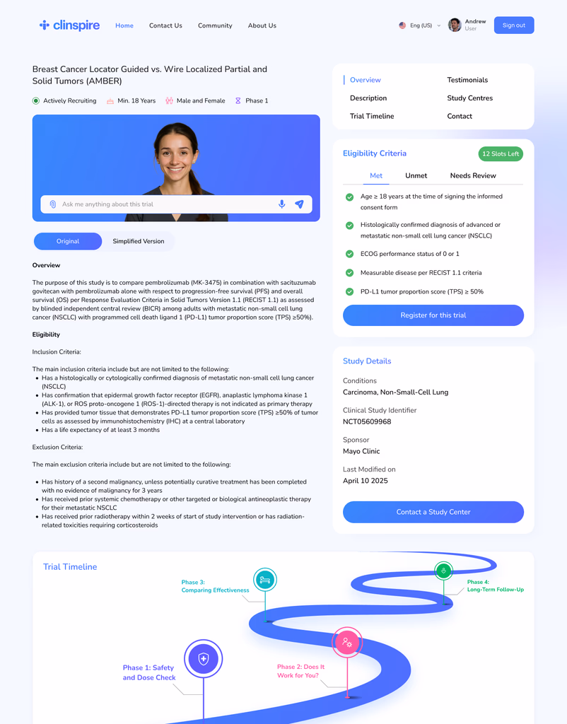
✅️ Top nav simplified section access
✅️ Eligibility grouped into tabs (Met / Unmet / Needs Review)
✅️ Key content surfaced early, clutter reduced
We finalized the third iteration as it struck the right balance between clarity, content hierarchy, and ease of navigation — ensuring users could focus on what mattered most, without feeling overwhelmed.

After finalizing our wireframes and designs, we conducted usability testing sessions with 10 patients to evaluate how well the interface addressed key challenges. We measured key usability indicators including drop-off rate, user trust, recruitment speed, and increase in diverse participation.
Outcome
45%
Fewer Drop-offs
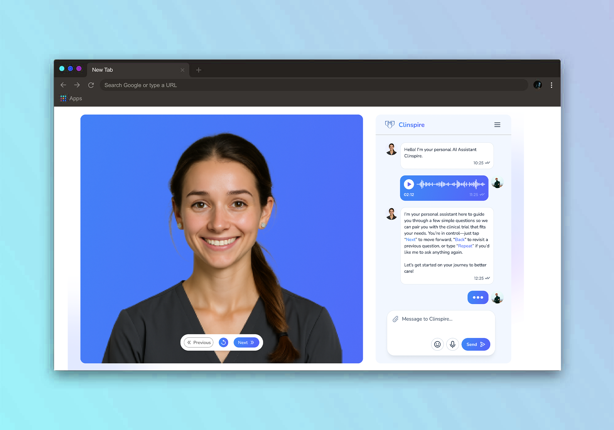
Conversational onboarding keeps patients engaged
The conversational and empathetic onboarding flow keeps patients engaged through sensitive questions, reducing abandonment and improving overall completion rates.
25%
Higher User Trust
Structured data and transparent AI build trust
Transparent explanations and structured information flow increased users’ confidence in the system’s recommendations, helping build trust and engagement during decision-making.
20%
Faster Recruitment
Automation accelerates trial startup and drug testing
The conversational and empathetic onboarding flow keeps patients engaged through sensitive questions, reducing abandonment and improving overall completion rates.
15%
Increase in Diverse Participation
Inclusive design broadens access and equity
Inclusive language and adaptive routing make clinical trials more accessible to underrepresented groups, promoting equity and improving research outcomes.
Patients didn’t just need to “find a trial” — they needed reassurance, clarity, and a sense of control. Features like eligibility clarity, emotional tone, and voice onboarding reminded us that trust is a design outcome.
Initial ideas focused on filters and automation, but after talking to patients and clinicians, we prioritized simplicity, plain language, and supportive flows. Their stories shifted our priorities.
Voice-assisted onboarding and simplified content weren’t “extra features” — they were essential. This experience taught us to center inclusivity from the very beginning of the design process.
Subtle shifts in visual hierarchy and layout made major differences in comprehension. Testing with real users helped us understand what truly worked — and what got in the way.
This project was deeply grounded in real user feedback. Thanks to the full participation of Mayo Clinic clinicians, we had the rare opportunity to closely observe the real-world struggles patients and providers face when navigating clinical trials.It allowed us to see firsthand how thoughtful design and AI can work together to make complex healthcare systems feel more accessible, supportive, and human.